

Colour Consultation
Choosing colours is the fun part! Let The Urban Palette help you find the perfect colour scheme to form a cohesive statement in any room or throughout the whole house. Or feel free to choose on your own! Here are some easy ways to find perfect colours for your home
The 3 Basic Colour Schemes

Monochromatic colour schemes use tints and shades of the same colour to create a sophisticated and elegant look. Colours from the same colour family tend to look great together.
For a calm, quiet room, select a neutral colour like brown or gray and apply different shades or values of that colour to various elements of the room. This approach is pretty popular because it allows you to vary the look of the room by changing the accents and accessories. You can add interest to the room by using a variety of textures on the floor, walls and furniture.
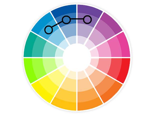
Developed from colors next to each other on the color wheel, analogous home color schemes offer more nuances while retaining the elegance of the monochromatic scheme. Usually, one color is dominant while others are used to enrich the effect. In other words they are color wheel neighbors!
For a relaxing effect, select a color scheme for your home composed of related colors: greens and blues or rose and peach are two examples. Keep the strength of the colors similar for a pleasing look.
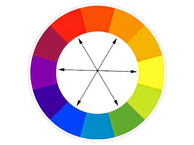
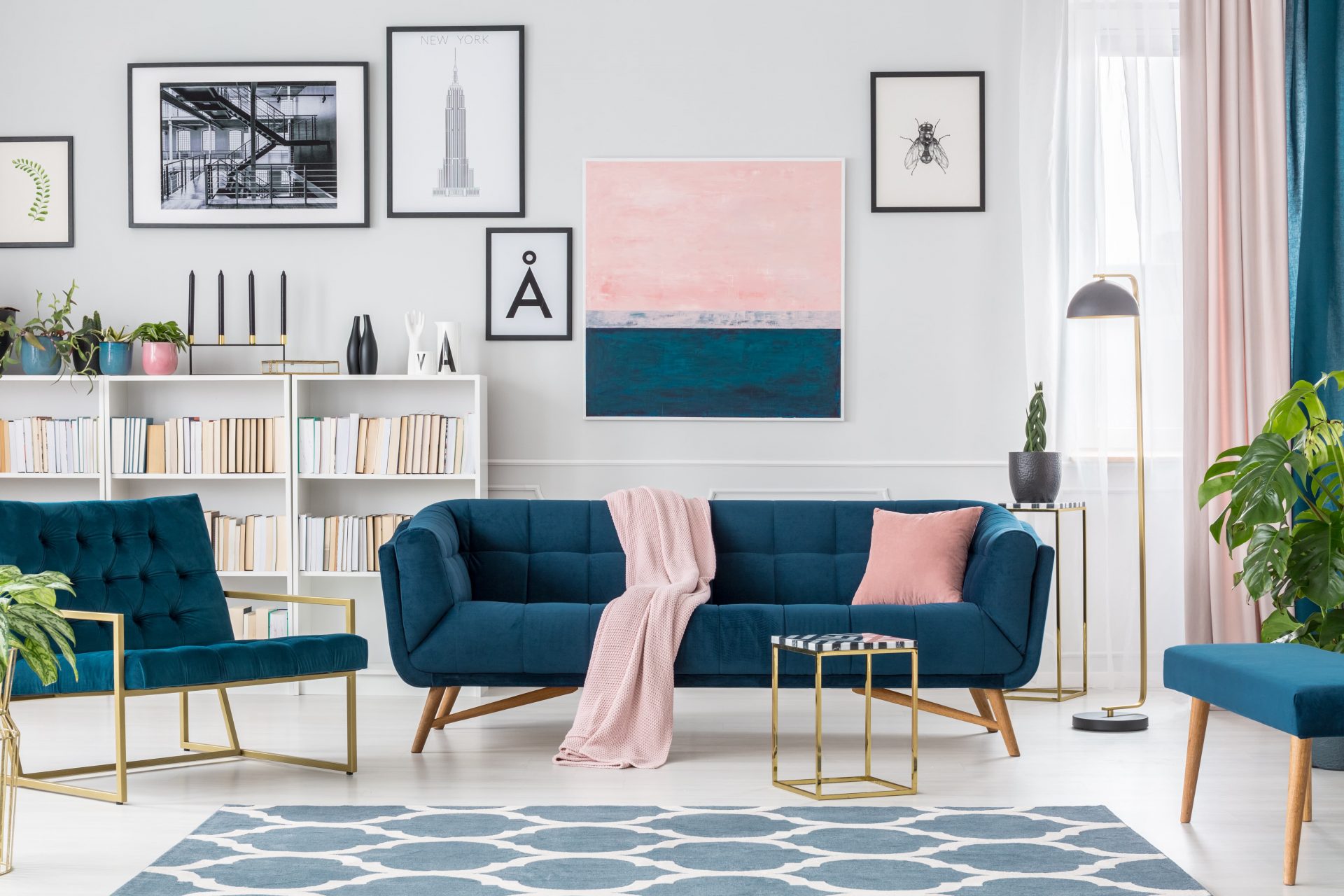
Complementary colors are opposite each other on the color wheel. These types of home color schemes add drama to any room. Complementary colors enhance the temperature of each other, which adds interest and energy to the décor.
To get the most out of this scheme, use a warm color against a cool shade or add contrasting accessories to highlight the color of your walls.
Find Inspiration
Watch your favorite decorating shows, check out home and garden magazines and design websites. Look around you: a favorite piece of art, patterned rug or colorful fabric can inspire your palette..
Pro Trick
Try the 60/30/10 rule, used by designers. With this method, one colour (often a light neutral) is used on about 60% of the room’s surfaces, a secondary colour (usually a medium tone) is used on 30%, and the third colour (often bold or bright) is used as an accent on 10% of the furnishings.
Narrow It Down
Now it’s time to see how the colours you like will look in your space. Head to your nearest Benjamin Moore, Sherwin Williams, or Farrow and Ball to pick up some colour samples you’re interested in and try them out on your wall! It may be tricky at first trying to decide so give it a day or two to acquaint yourself with your colour selection. At The Urban Palette you pay what we pay for paint, with our contractor discounts! This can save you hundreds!
Contact Us
It makes us happy when our clients are happy. Try us out, you won't be disappointed!